When I stopped using the Haddock and Dunn text, I decided to keep this topic in the class because it is so important and because I don’t see these things covered in other science classes…
Two main types of graphics
There are two main types of graphics files: raster images and vector art. Raster images are also called bitmap or pixel images–these tend to be photos, sensor images, scanned files, etc. Vector graphics are illustrations or art made with software that uses mathematical or programmatic instructions to define the objects in the image.
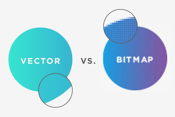
As the image above shows, as you enlarge a vector image, it will continue to have smooth curves and lines. Bitmaps, however will start to show the individual pixels as they become large enough to be seen, resulting in jagged edges and blurriness.
| Type | Vector Art | Raster Image |
|---|---|---|
| Infinitely scalable | Set pixel dimensions | |
| Sample formats: PDF, EPS, SVG, AI |
Sample formats: PNG, JPEG, TIFF, BMP |
|
| In print | Most figures in a printed paper | Printed photos |
| For screen, web or presentations | Diagrams, graphs, maps * | Photos |
*I frequently make my web images as vector art, then export as PNG for websites.
Raster images
Common raster image applications:
- Adobe Photoshop
- Powerful, but expensive
- Gimp
- Free, open source, but can be harder to use and somewhat limited
- Affinity Photo
- Similar to Photoshop, but much less expensive!
Common raster image formats:
- JPEG-8-bit to 24-bit color. Usually lossy
- TIFF–flexible, has many implementations. Up to 48-bit color. Can be lossless.
- RAW–minimally processed data from the image sensor (a digital negative). Differ from manufacturer to manufacturer.
- PNG–Patent-free replacement for GIF. Often used for web images. up to 48-bit color.
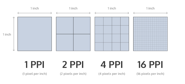
Resolution
The resolution of raster images refers to the number of dots (in print) or pixels (on screens) per inch (in the US) or cm (in the rest of the world). This image below shows four rasters of different resolution. Each is a 1-inch square, but they have different resolutions: 1, 2, 4, and 16 pixels per inch or PPI.
Historically, monitors were designed with 72 ppi and magazine quality photos were printed at 300 dpi. While print has remained at about 300 dpi standard, because of so many different sizes and types of screens, and the distance from which they are viewed, screen ppi’s vary quite a bit from the standard 72 ppi to almost 500 ppi on high-end phone screens.
A raster image can be downsized to display at a lower resolution, but cannot be shown with more pixels than are in the original image. It is typically best to save images with the highest resolution possible to avoid loss of information.
For publication, most journals request 300 dpi resolution for raster images.
Resolution and size
It is important to understand that image resolution and size are related. If you have an image that is 3,000 pixels by 3,000 pixels in size and you are preparing it for print at 300 dpi, this image would be 10 inches by 10 inches. If that is the size you want, you are fine. But there is no way to make the image 20 inches by 20 inches at 300 dpi.
It is important to understand how big the image will be in print and the resolution, to know how many pixels are needed to achieve those results.
Additive vs Subtractive Color
Monitors, TVs and projectors create colors additively–add wavelengths of light to create the desired . Print is subtractive, more pigment is added to absorb light of certain wavelengths to reflect only the desired wavelengths.
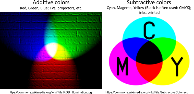
These differences in how colors are produced and which colors used to produce the desired color sometimes make differences in how images are displayed. This relates to the next section, color space.
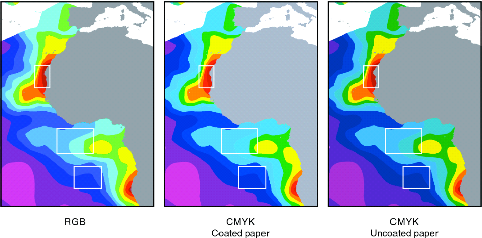
Color space
Your eyes, different screens and different printing technologies can perceive and produce different ranges of colors–this is referred to as the color space or gamut. The image below shows an approximation of the visible color gamut, and some other common color spaces.
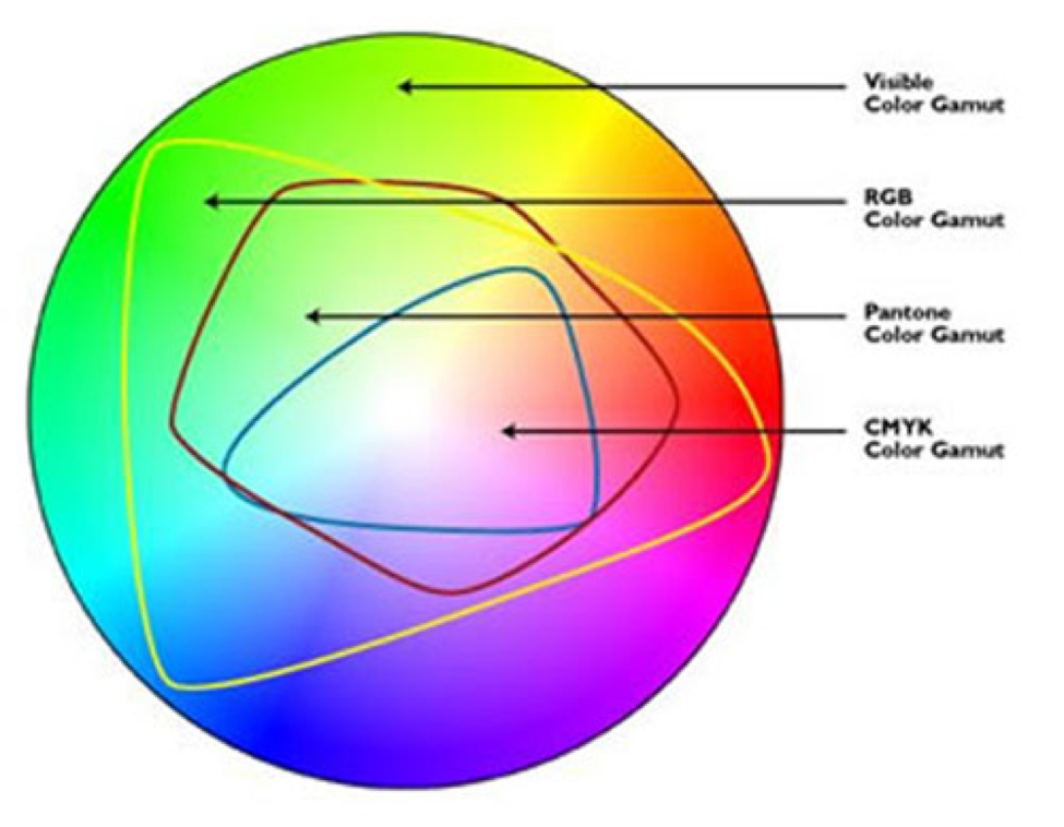
When selecting colors for figures, keep color spaces in mind along with how the image will be used. Depending on your screen the image below may or may not show some of the simulated differences among the image colors. If the point of the figure relies on the differences among colors that, in one particular color space cannot be distinguished, that is not a good choice of colors.
Color choices: Color blindness
When selecting colors for images, consider your audience and understand issues of color blindness.
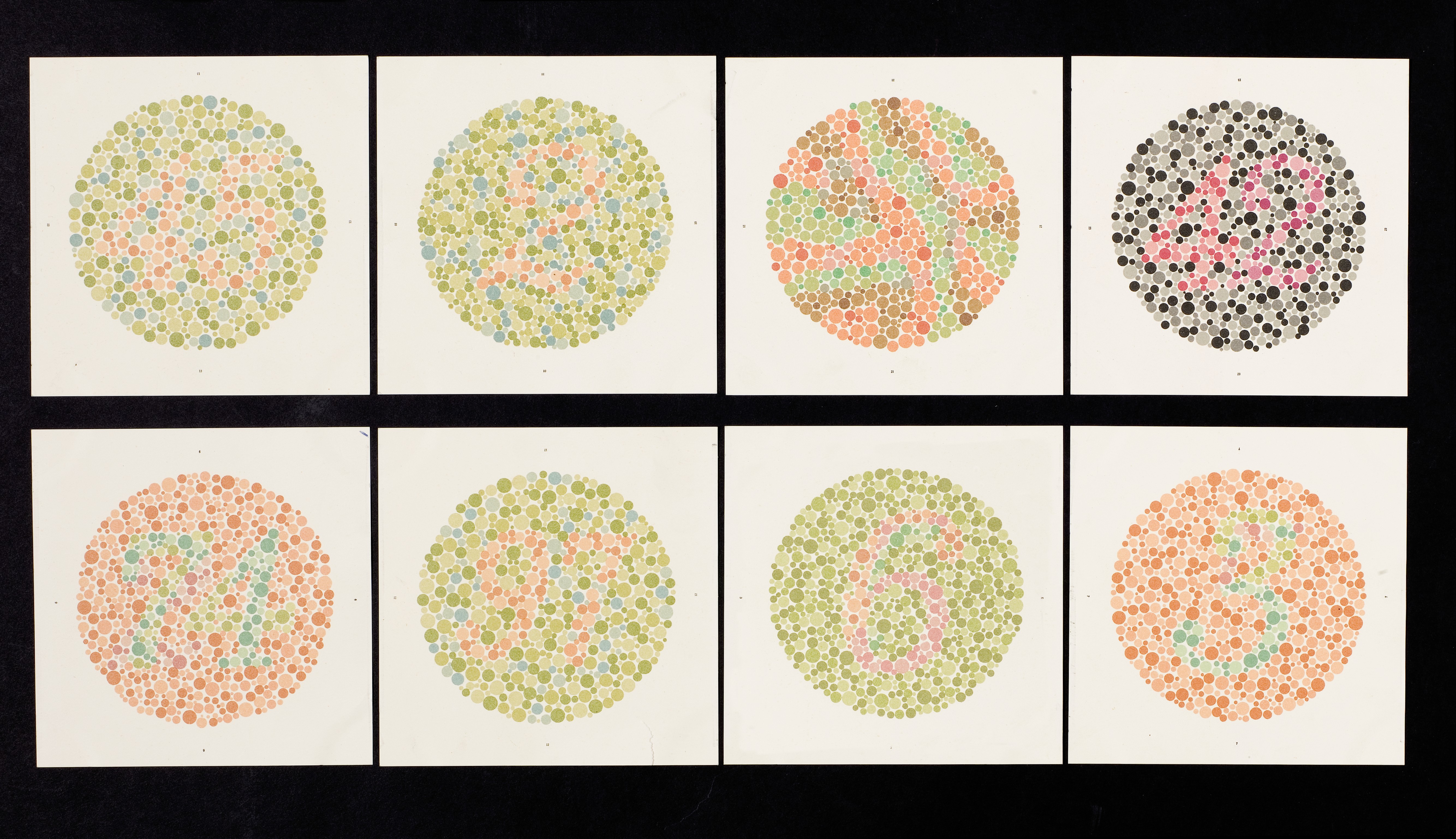
See also on Twitter @red_green_plot
Color choices: Aesthetics and visibility
Also consider aesthetics and visibility!

Color depth
Similar to data types and the idea of using different number of bits to store an integer, you can use different numbers of bits to store the colors in images. More bits translates to more colors, but also large files sizes.
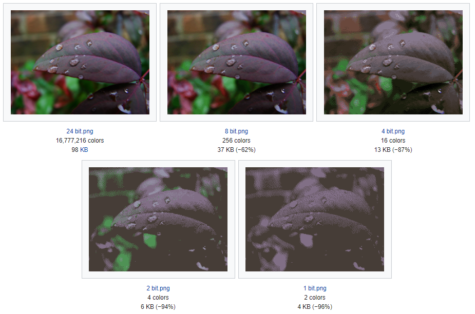
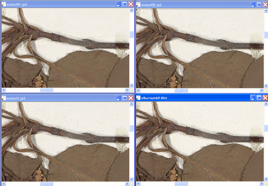
Image Compression
- Lossless
- De-compresses to original values
- LZW (TIFF)
- JPEG 2000 (can be lossy)
- Lossy
- Cannot de-compress to original values, only approximations
- JPEG is ver common web format
- High compression ratio –> Lower bandwidth
- Selective compression: Lossless to more compression
The images below show the loss of detail with higher compression.
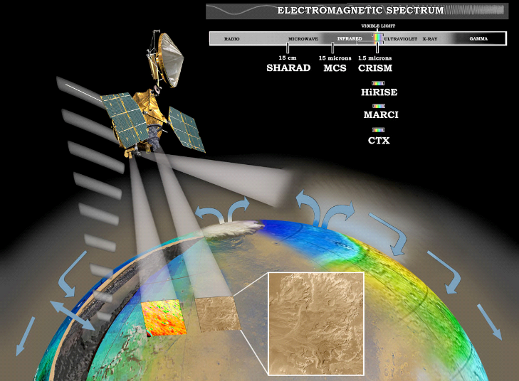
Beyond visible light
Increasingly imaging sensors capture wavelengths of light beyond what humans can see. These hyperspectral images can offer insights into temperature, photosynthetic productivity and more. The images are often transformed into the visible spectrum for analysis.
Vector Images
The number one thing…don’t use PowerPoint!! It’s great for presentations, but if your goal is to produce publication ready images, PowerPoint is the wrong tool!
Common vector art applications:
- Adobe Illustrator
- Powerful, but expensive
- Inkscape
- Free, open source, but can be difficult and limited features
- Affinity Designer
- Similar to Illustator, but less expensive
Common vector image formats
- PDF–Adobe proprietary, though somewhat open
- SVG–Scalable Vector Graphics; an open standard
- EPS–Encapsulated PostScript; often used for printers
- AI–Adobe Illustrator format
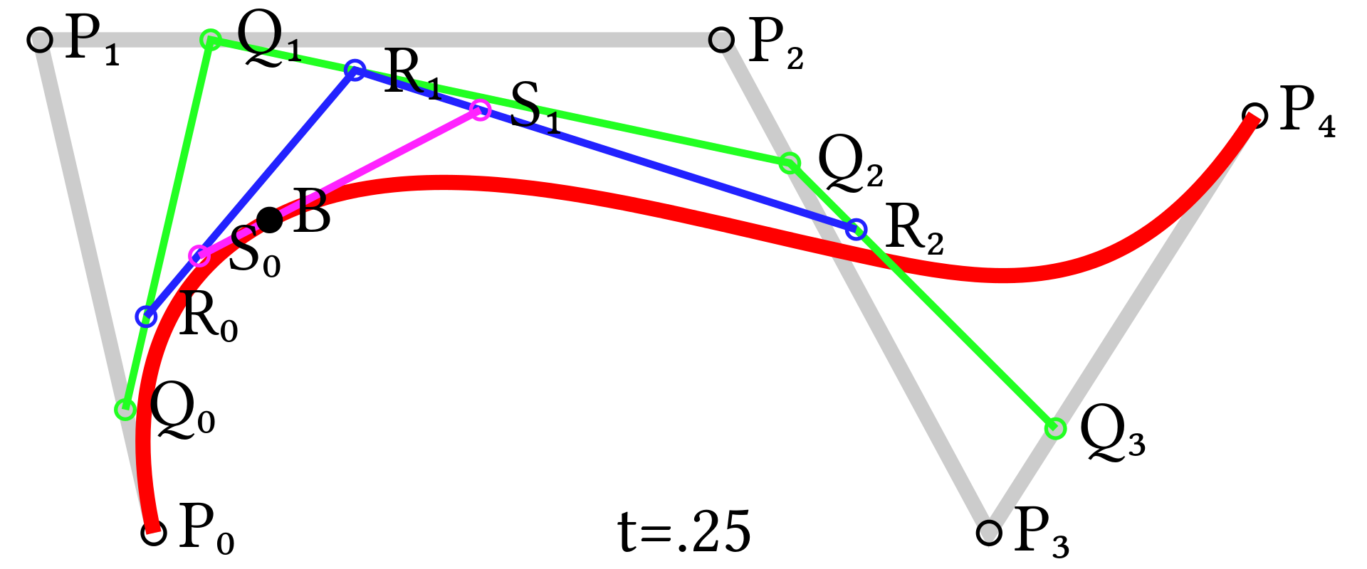
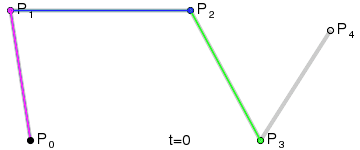
Bézier curves
Bézier curves are sets of polynomial equations used to model the objects (paths) in vector graphics. Because the paths are defined by scalable equations, resterization is not an issue and they can scale easily. Bézier curves are also used in animation where they describe the physics of motion.
Scripting your graphics
There are tools to create and modify both raster and vector graphics. We have already looked a bit at making plots with matplotlib.
- Many graphical Python applications use PyQT
- There’s also the PyQtGraph module
- For more ideas, check out this page on Graphical Representations of Data
Here’s an example of using PIL to identify C. elegans (nematodes) in an microscope image.
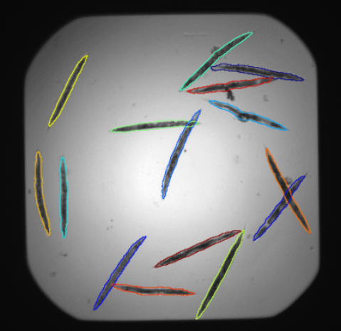
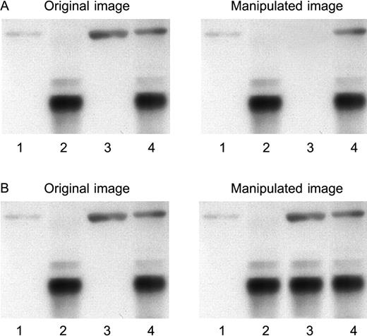
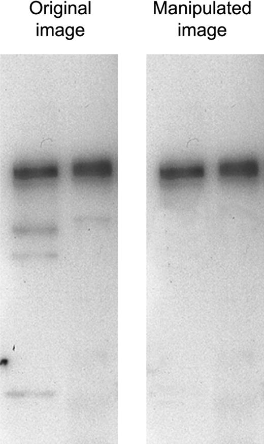
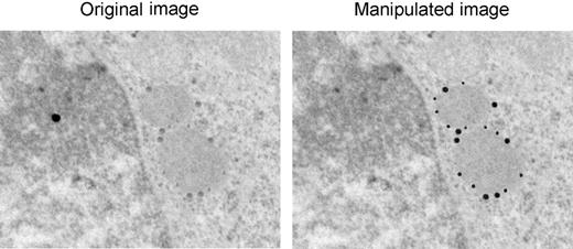
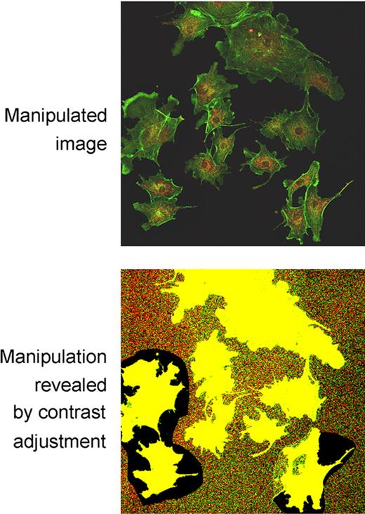
Image ethics
Given that just about every image is digital, and most will have some post processing done on them, how much is too much??
- Correcting the exposure?
- Removal of dust?
- Cropping to remove part of the field of view?
- What if the cropped area differs from the story being told?
- Clone a portion of an image and replicate?
The following are images from Rossner and Yamada (2004).
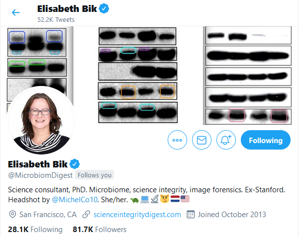
Another great source for this kind of image manipulation is Elisabeth Bik (on Twitter @MicrobiomDigest, Blog Science Integrity Digest)
Also see @RetractionWatch
For suggested guidelines, see:
- Nature: Image Integrity and Standards
- Elsevier: Five things every researcher should know about image manipulation
- Check the journals in your field or where you plan to publish. Keep and share original images.